The Skeletal Spotlight shines this time on:
The Scream cover art from issue #6, June 1974
(Click on images to enlarge.)
(Click on images to enlarge.)
"Always after me Lucky Skull!"
In this awesomely rendered cover painting, Dr. Frankenstein looks as if he has fared a bit more worse for the wear than his movie counterpart. Based on a publicity photo of Peter Cushing for "Frankenstein Created Woman," pictured below, the cover art was for the story inside titled "2073: The Death of The Monster."
"A hush falls over the crowd as Dr. Frankenstein concentrates on getting the spare he needs to win this bowling tournament."
In preparing this blog entry, I was a bit conflicted... the cover was right for Sweet Skulls, but the story inside was more suited for Monster Memories. So, with true Solomoniacal wisdom, I decided to split the two up, put them on each blog, and cross promote the two. If I weren't so humble, I'd say I was a genius.
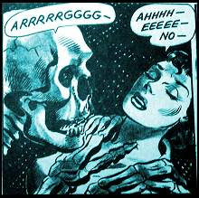
The panel above comes from the story inside, a neat little tale of the Monster's ultimate end. Of course, he's been dead "for good" before, so consider it just another chapter in the life and many deaths of the Creature.
To read and enjoy the whole tale, go to the Monster Memories entry on it!














3 comments:
I love that cover art!! And cool that you found the actual photograph the artist used as reference!!
I think it was Image who were going to original use that Cushing photo for the cover of From Beyond the Grave, there was an early version of it posted on Digitalbits, and besides the fact they were potentially using a picture from the completely wrong film it was so boring looking as they had removed the atmospheric lab background and stuff. They scraped the plan however and went with an even more generic cover for the dvd release, even though the original poster art is gorgeously CLASSIC.
Karswell,
I hate it when a film had a classic poster image, and it's not used for the DVD, but rather some lame screen capture or something! The Midnight Movies did that a lot, like with "Scream and Scream Again." Also "The Haunting of Hell House" is a good example of a bad cover, when the poster was classic.
Post a Comment